A third path between engage and dismiss.
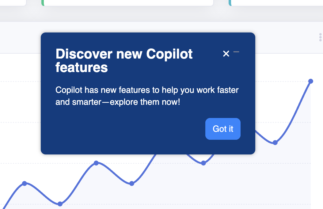
End users get a new minimize action on Tours, Modals, and Microsurveys. A small pill stashes the Experience at the bottom of the screen until they're ready.
The user controls when, not just whether.
Today, an end user has two options when a Tour, Modal, or Microsurvey opens: complete it or dismiss it. Dismiss is a one-way door. We lose the engagement and the user loses the thing they might have actually wanted — they just didn't want it now.
Minimize is the third path. Pause it, get back to work, come back to it on your own terms. It only works if the paused state feels like the user's own pinned content, not a corner bubble nagging from the runtime.
One pill, anchored bottom-right.
When the user minimizes, the Experience hides and a 320-pixel pill appears at the bottom of the viewport. Icon left (from Chameleon's per-type defaults), title right (truncated generously — most titles fit at rest). Background is the Theme primary accent; everything else inherits.
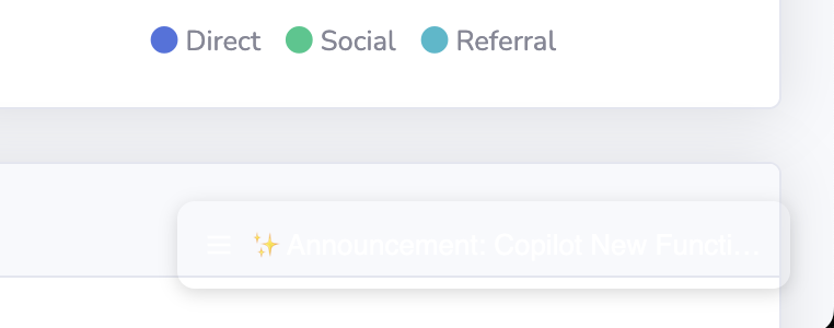
Hover grows the pill taller — never wider.
Hovering anywhere on the pill expands it in place to reveal the full title (up to two lines), the Experience type label, and a progress bar with step/question count. Width stays fixed so the pill rail doesn't shift around. A tooltip above the pill reads "Click to resume experience."
Click resumes — the pill disappears in the same place it came from.
Clicking the pill re-shows the Experience in its original position, preserves progress (Microsurvey question 2 of 4 returns at question 2), and removes the pill from the rail. The animation matches the minimize transition in reverse — the pill is the same object as the Experience, paused, not a separate UI.
Off by default. On by Experience type.
Admins opt in per Experience. New Experiences inherit the default for their type (set at the account level). This keeps the rollout safe — no surprise pills appearing on a customer's product on day one — and lets adoption follow conviction, not toggles.
- Account-level default per Experience type (Tour / Modal / Microsurvey).
- Per-Experience override on the publish modal.
- Telemetry from day one: minimize rate, resume rate, time-to-resume, dismiss-after-resume rate. These tell us whether minimize is a pause or a polite dismiss.
The harder questions, saved for V2.
- Anchored Tours — the spatial model breaks when the target element scrolls offscreen.
- Mobile — pill rail doesn't survive small viewports without rethinking the bottom region (where Chameleon already plays).
- Persistence across sessions — V1 minimize state is in-session only. Cross-session needs an explicit conversation about cookie strategy.
- Stacking limits — if a user has minimized seven Experiences, something else is wrong upstream. We'll watch for it and cap later.
What I learned writing this one.
The spec went through three drafts before the team and I agreed on what minimize meant. The shortest version: "is this a pause or a soft dismiss?" Until that was nailed, every UI conversation was actually a values conversation in disguise. Naming the principle in section 01 — the user controls when, not just whether — collapsed a half-dozen open threads. Worth the time.
I'm leaning into visual specs (rather than long Notion docs) because designers read them and engineers don't get lost. Bullet specs scale badly past a few hundred words; a sectioned, illustrated spec gets better the longer it is.